Livechart 3D
|
Plot
Color by
Value
Percentile
Size ↕ ↔
• Plot guide •
Use the set buttons to assign the axis dimensions and your mouse to rotate, zoom-in, or zoom-out the plot Click on a nuclide to open a page with ENSDF data (pop-ups must be allowed) The "lower" and "upper" limit fields set the allowed boundaries for each axis. After the plot is generated, they are filled with the actual lower and upper values found. Replot again to have an optimal framing Additional filtering can be applied to the Z and N ranges using the Filter box. In case one of the axis is set to N or Z the axis limits take precedence and the filter box is disabled Fission yields are available ony on the z-axis Set the axis value to constant to obtain a bi-dimensional plot • Tips • Use the "log scale" and "Color by percentile" options when plotting quantities having a very large range, like Half-life or fission yields 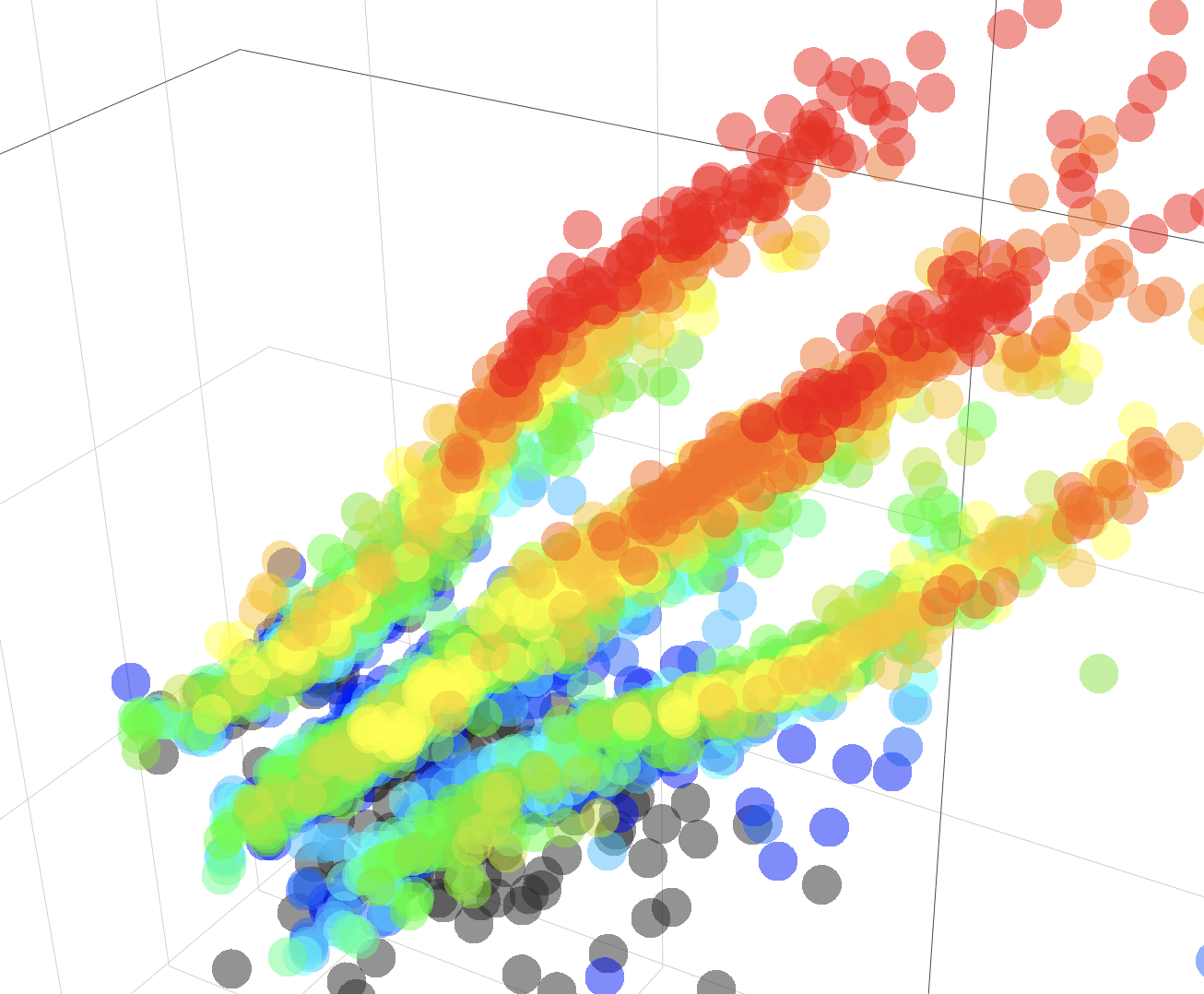
• Play with the data to find patterns • The standard choice for the axis would be x = N, y = Z, and z = any quantity, but when you change this standard choice you might find interesting patterns • Data sources • The same as in Livechart
Filter
≤ Z ≤
≤ N ≤ | |||
|
set X
log
lower limit upper limit
set Y
log
lower limit upper limit
set Z
log
lower limit upper limit
|
